Astro Digital / portfolio
While doing a 2015 summer fellowship at Development Seed, my main client was Astro Digital, a start-up that lets you easily search and publish satellite imagery through their imagery browser. My main role on the project was working on the user profile accounts, where you can store all of your published maps in one place and set alerts to let you know when new imagery is available in areas that you want to track.
I led the discussion on how to direct users through the website and create a cohesive experience. When I came on the project, there was no connection between the imagery browser and the user profile, which were built as two separate applications. The two platforms looked and felt detached from each other. I created wireframes for how the site should flow from one platform to the other to create a seamless experience. This also included figuring out how users should create accounts and log in.
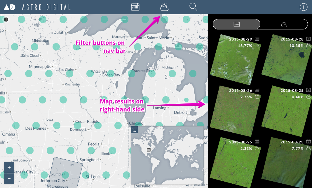
The imagery browser originally had the interactive map on the left-hand side of the page, with the available imagery on the right-hand side. It also had the filter buttons on the top menu bar.
Original design for the Astro Digital imagery browser:
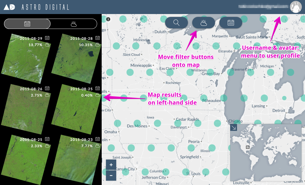
I proposed that we swap the placement of the interactive map and the available imagery to match the layout of the user profile. I also proposed moving the filter buttons from the top navigation bar to be on top of the map. This allows the blue navigation bar to match across the two platforms, as well as place the buttons that affect the map results to be on top of the map itself. Clearing up the blue navigation bar also gives space to put the user’s name and avatar in the top-right corner. The user can click on that menu to go to their user profile to see their maps and alerts.
My new design for the imagery browser:
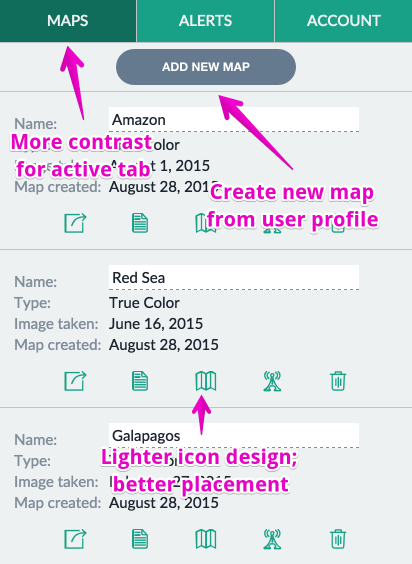
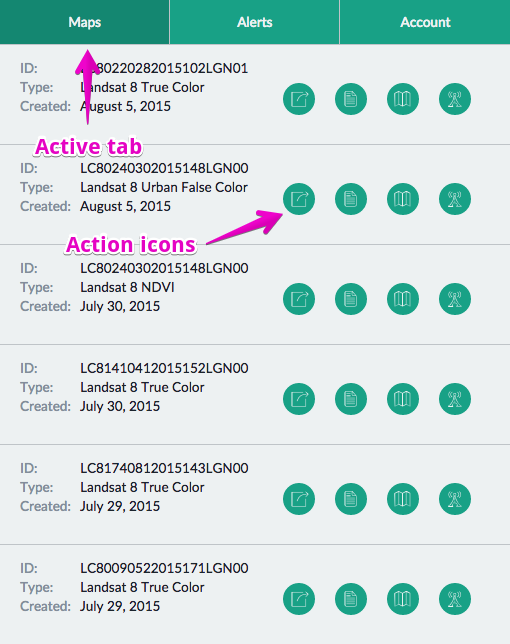
I also worked on some UI redesign to create a cleaner interface. I changed the action icons from dominating green circles to lighter buttons, mimicking the familiar Twitter interface. I differentiated the secondary menu’s text from the text on the rest of the page and increased the contrast between active and inactive tabs.
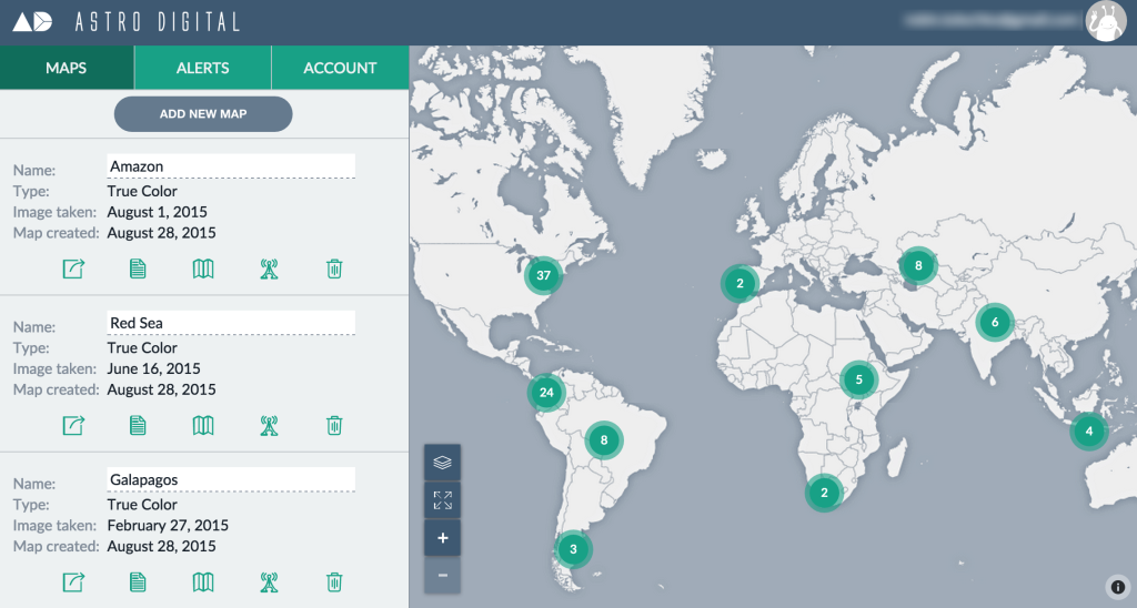
Original design for the user profile page:
My new design for the user profile page: