Modern Motherhood / portfolio

About:
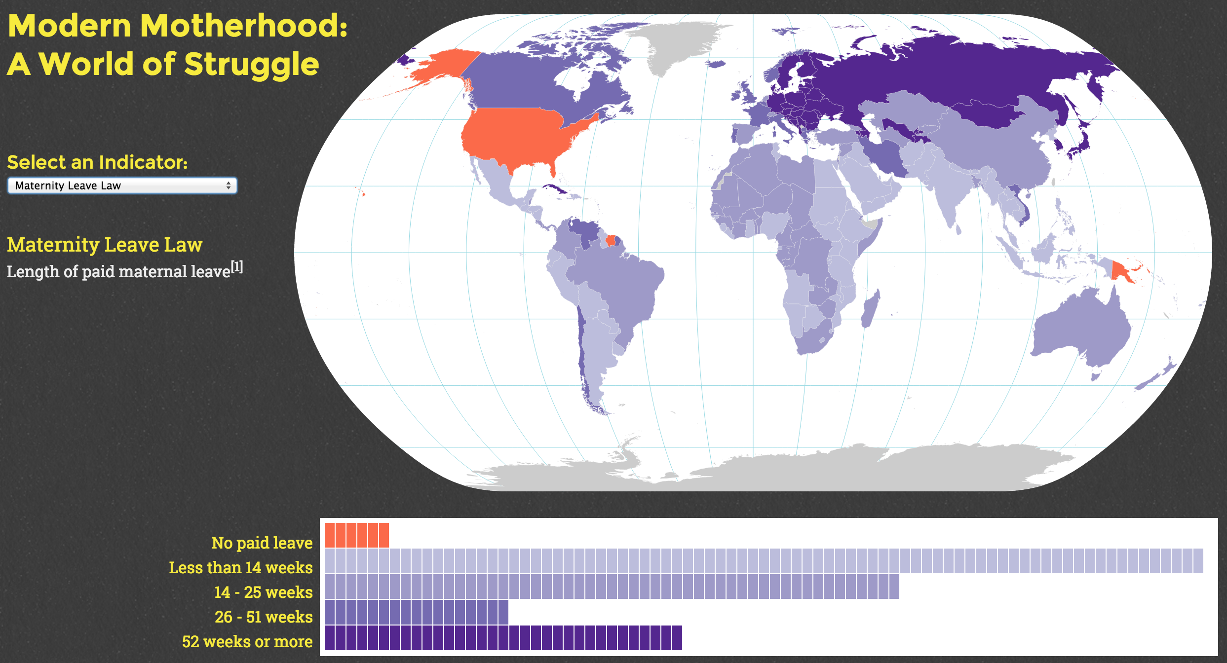
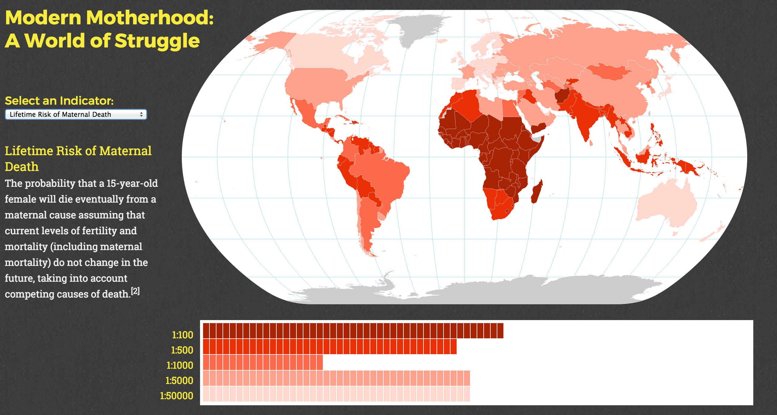
This was my first attempt at using D3 to creative an interactive map, and it was really, really fun. I love mapping issues that I care about, and was taken aback by some of the insight that I gained from exploring the various indicators presented here.
I was initially inspired to map these topics by this NYTimes map of maternity leave policies worldwide, which was published right before I got pregnant. It seemed odd that Bogota, Colombia (where I was living at the time) was a better place to have a kid as a working woman than the United States.
I am under no illusion that the maternal leave map is actually indicative of the situation in each country; I am aware that in many countries, the official policy may be that women get paid maternal leave, but the reality is that many women don’t have formal employment or may not qualify for other reasons. This is a subject I’d like to explore further.
The Maternal Death indicator shocked me. In too many countries, the rate is higher than 1:50, meaning that 1 in 50 women will die from some maternal cause.
